AHHPEROL
Role
Graphic Design, Typography Exploration.
Year
March 2024
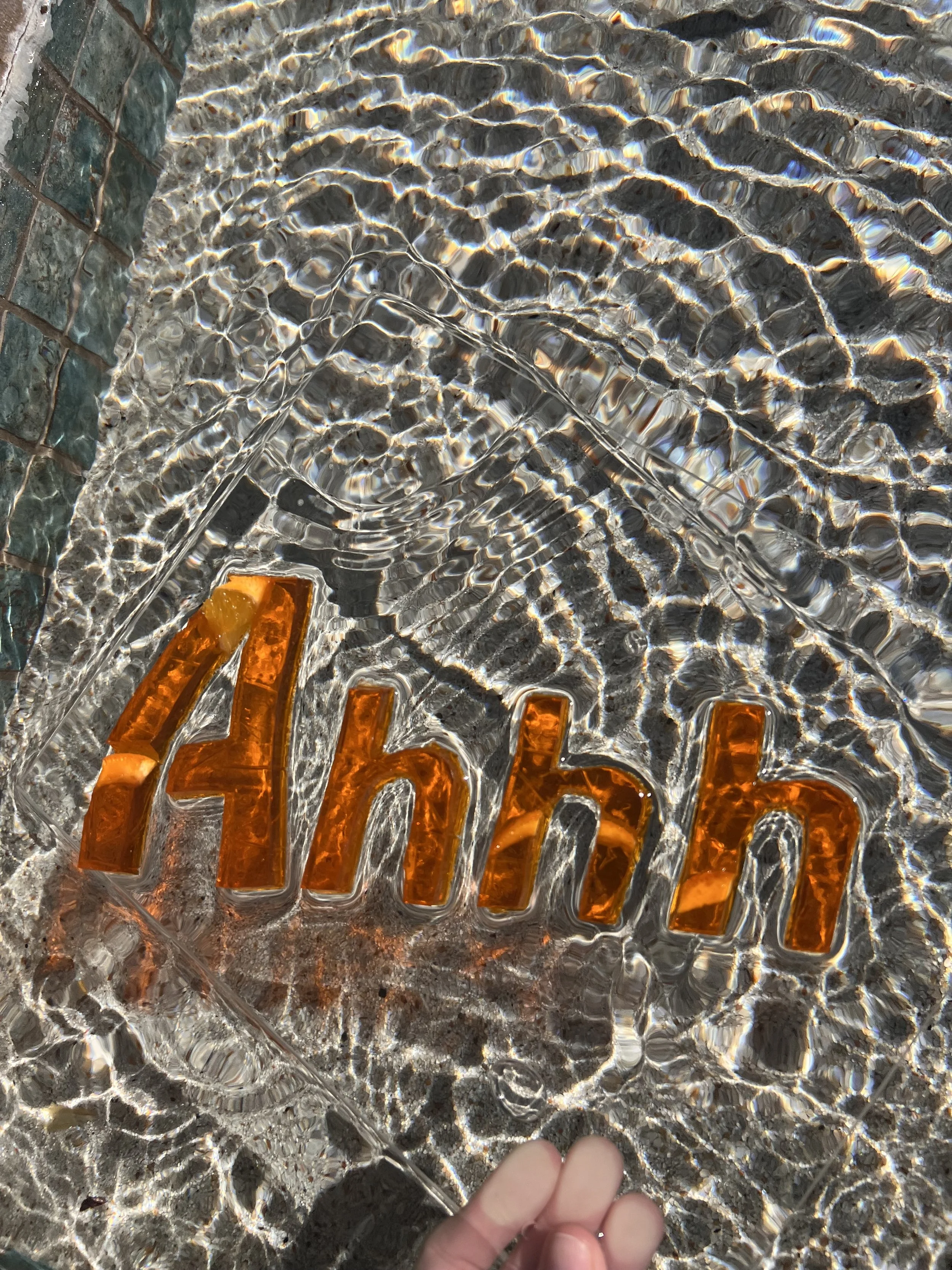
When developing a poster for the Aperol brand, I immediately knew I wanted to keep the refreshing aspect of their previous ADs, while adding a twist. After deciding to use a play on words, I felt I had to do something extra to the “ahh” in the copy to further demonstrate the refreshing nature of Aperol. As a result, I began exploring materials to develop a non-font that had this effect, ultimately landing on Orange Jell-O for the final look.


Type Exploration process
-
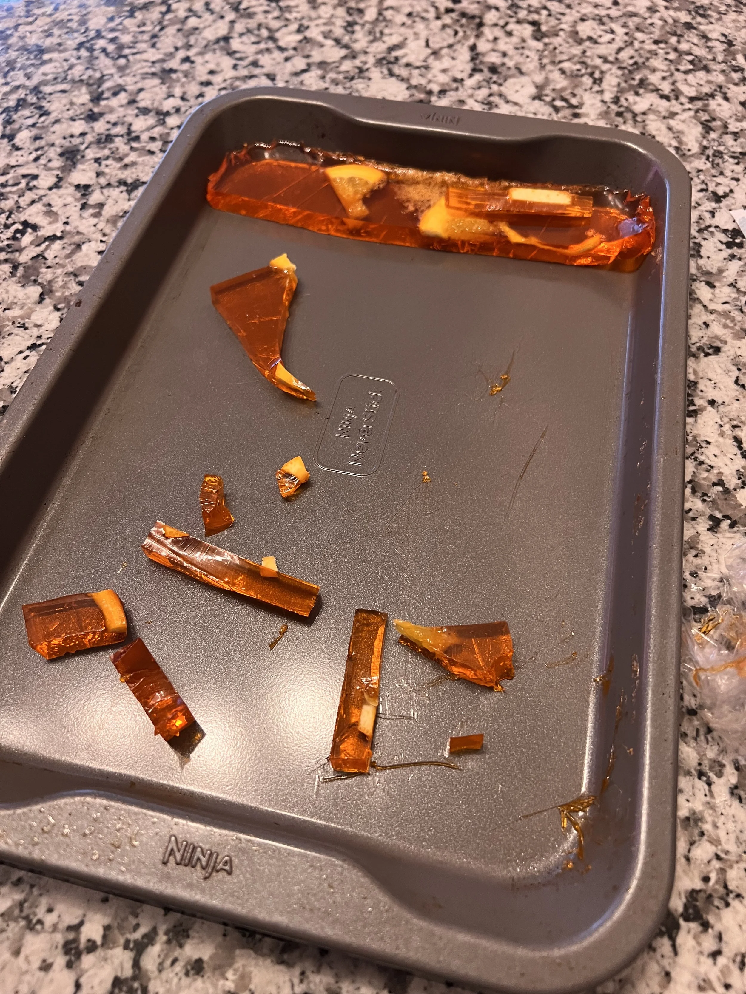
Making the jell-o
I began by making the Jell-O on a flat tray to make the font easier to cut for images.
-
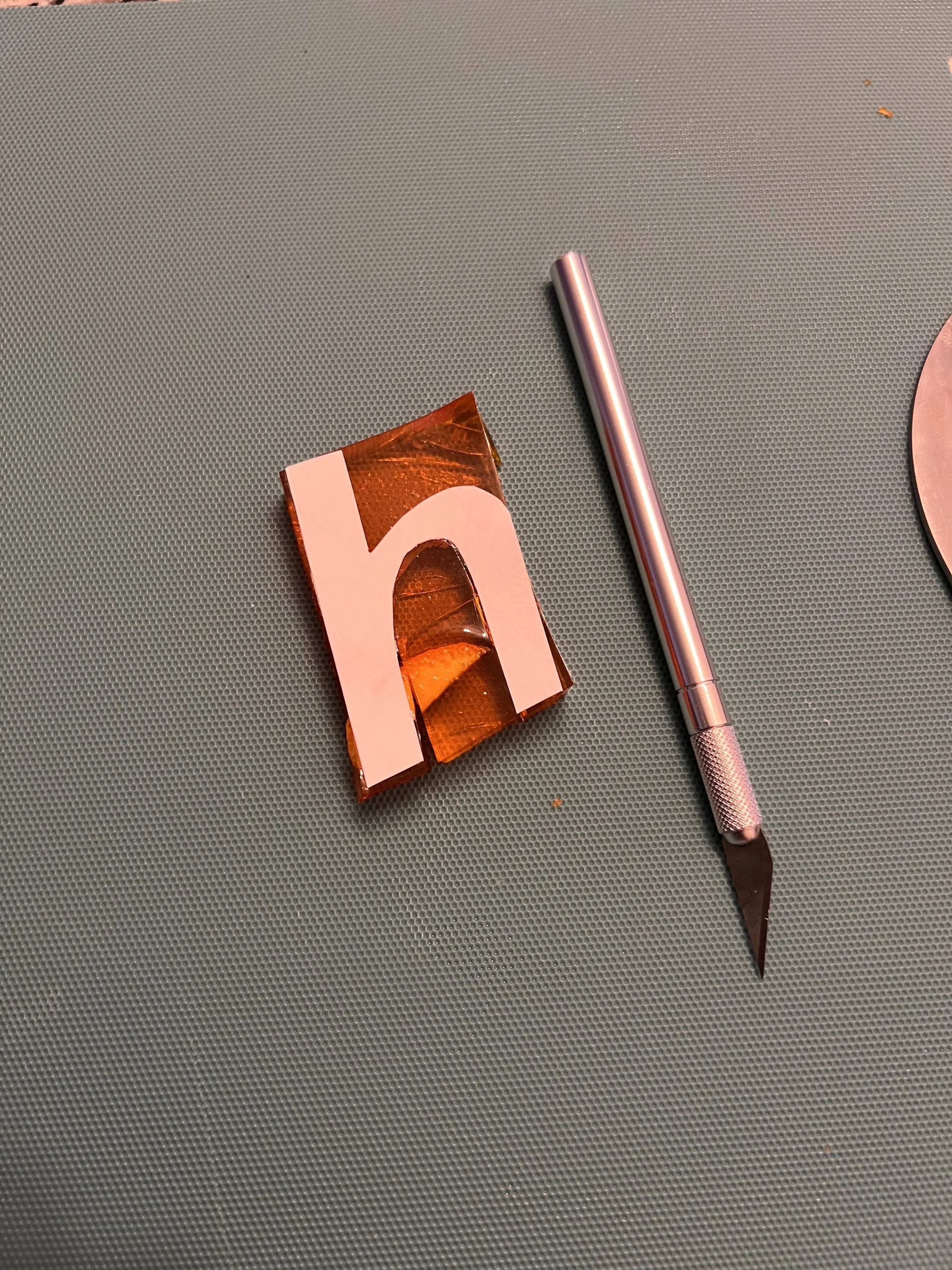
Making the font
After creating a stencil of my font, I began cutting into the Jell-O with and exacto knife to get as precise as possible.
-
Arranging & images
Finally, I arranged the letters on an acrylic slab and took some images over a pool of water to add the refreshing shadow effect.